Monday, November 21, 2016

Rest

This will be the last post on this blog for a while.

I still want to make art.  I will continue making art.  I want to take time off to think about what kind of art I want to make.  I haven't given that concept as much thought as I should have.

So for the rest of this year, and probably a few months into next year, I will be revisiting art basics–anatomy, perspective, gesture drawing, life drawing–and thinking about what I like to draw, what I want to draw, and what I want to accomplish in life.

I hope my art was inspiring to you in some way.  I will be back.
 

Monday, October 31, 2016

Arrangement of Pumpkins

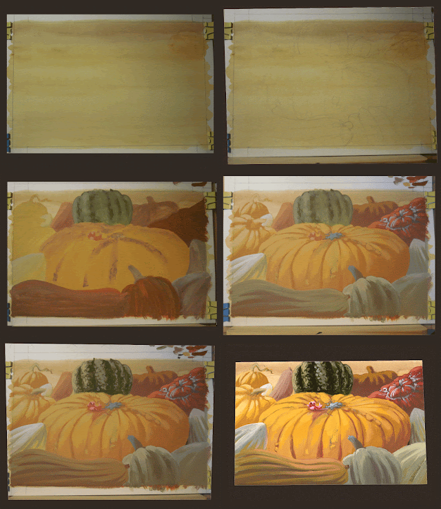
Happy Halloween!  For this painting I gathered my favorite reference images of pumpkins and squash from both my own image library and the web, and compiled them into a single picture.

The painting started with a watercolor wash over the paper, so that the bright white wouldn't make it harder to mix the proper colors.  It turned out I had difficulty mixing colors anyway.  As the gif below shows, I went over several of the squashes and pumpkins more than once when their colors did not come out like I wanted.
I'm pleased with how it turned out, but mixing gouache colors is still a challenge for me.  It's definitely an area I will look into improving.

Monday, October 17, 2016

Foraging Roosters

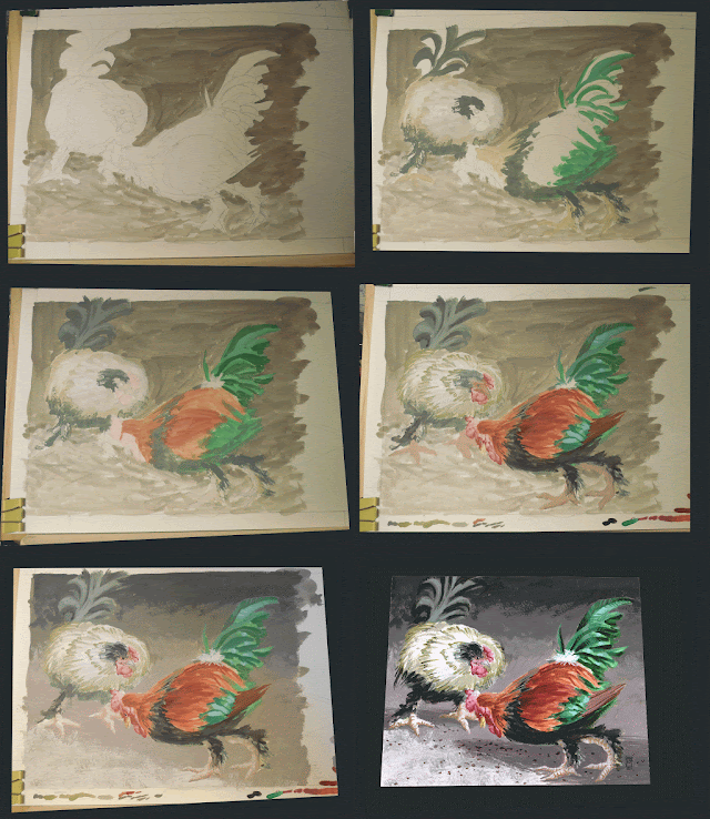
This is a scene constructed from photos I took of free-ranging roosters and chickens in a rural area.  The medium is gouache.

Since gouache is opaque and allows for easy corrections, I laid out the midtones first, the largest areas of color.  Then I add darker details to the figures, finished the background, and added the final highlights.

Monday, October 3, 2016

Creature Design Workshop Results

Back from the creature design workshop!  My classmates and I learned about designing realistic fictional creatures from Terryl Whitlatch; she has done many illustrations for biology and paleontology purposes, for books and fiction, and also for movies (such as Star Wars Episode I, where I first learned about her work).  She was an excellent teacher, very helpful and dignified.  It was good to meet her, and great to learn from her.

Terryl's theme through the workshop was designing fictional creatures that could theoretically evolve, live, and reproduce in a manner as close to reality as possible.  She made a distinction between "chimeric" creatures–beings put together from the parts of various creatures, such as classically mythological creatures like centaurs, griffons, the Sphinx–and "discrete" creatures–beings that could theoretically exist and be molded by time, their environment, genetics, and so on.  If they had elements inspired by different creatures, they would be worked into the design as if the creature naturally had those traits.  Our mission in this particular workshop was to design flying winged carnivore/predator creatures.
 

During the workshop, I made two creatures.  Since I had sea creatures on the brain, I sketched ideas out for combining various existing animals, and ended up combining a krill and a flying fish to create a flying krill.  I envisioned it as a small creature, one that would frequent the very top layers of the ocean, hunting smaller organisms and flying away from danger when threatened.  I shortened and smoothed out the krill's body, and gave it angled wings, large enough that it could dart away from danger, but not so large they would interfere with swimming.  (Rather, they would assist in helping the krill swim.)  It had frilled legs to give it traction against the water and swim properly.  And it had the eyespot on its tail to direct its predators away from its vital parts.  The feathery antennae should've realistically be more like the actual krill's antennae, but I was feeling fancy and made them frilled like a moth's antennae.


The second creature was a combination of vulture and nighthawk.  This one was a large bird, living on a planet with one-sixth the gravity of earth.  It could fly much higher and spend more time in the air than a bird from Earth.  With lighter gravity, its prey would also fly higher and be easier to hunt for.  Inspired by the vulture's capability to cruise for hours, and the nighthawk's lifelong sustenance on insects, I combined those attributes and came up with a cruiser hawk, a four-winged creature that would spend almost all of its life on its wings, moving up and down through the atmosphere and living on the giant insects that it shared the planet's atmosphere with.
Terryl brought samples of Copic markers and pens, which we used to make our illustrations.  I liked how they worked, I will likely buy a set of them.  The workshop was excellent in all aspects.  If you like drawing creatures and get a chance to attend an event with Terryl, do it.  You'll enjoy it.
Monday, September 19, 2016

Sketches 9/19/16 - Animal Practice 2


Less than a week till the creature design workshop!  More practice sketches for you all.


Monday, September 12, 2016

Dragon on a Book Cover

Songs of My Imagination is now available here on CreateSpace!  It's a collection of fantasy-themed poetry by my friend Alena Morgan, and she graciously gave me the opportunity to paint the cover.

If you want to know how I created the cover, check out Part 1 and Part 2 of the process.

Monday, September 5, 2016

Sketches 9/5/16 - Animal Practice

Marine iguana.
Drawings from my sketchbook, as I practice for the upcoming creature design workshop.
Hummingbirds.
An axolotl.
One dungeness crab, one seven-eleven crab...
...and the awesome monstrosity that is the coconut crab.

Monday, August 22, 2016

Port Jackson Pup

I like the Port Jackson shark.  It's a goofy little shark that lives around the coasts of Australia.  They grow to 30-36 inches in length and use their broad, flat teeth to crush and eat mollusks and echinoderms.  You can read more about them on their page at the Australian Museum's website.

I drew the outline in HB and laid down the lightest layers in 2H and HB.  I reinforced the darker areas (the harness patterns and overshadowed tail section) with another layer of HB.  Then I put down the darkest areas with a 4B pencil.  The final steps were shading in a minimal background in 2H, and using the 2H pencil to burnish the dark areas to make them less grainy and smoother.

This was another step in my practice for my upcoming creature design class.  Tune in next time for another animal drawing.

Monday, August 8, 2016

Orion Nebula

I started this painting nearly a year ago (last October, to be precise), when I was painting several variations of the Orion Nebula.  What inspired me was a false-color image of the Nebula's "tracer bullets"–globs of stellar dust shooting across space–colored in bright orange and blue.  You can read more about the tracer bullet phenomenon in this article by the Faulkes Telescope Project.
The original reference image.
There was some pre-planning to this painting, but not a lot.  I was afraid I would procrastinate on it and end up not doing it out of various fears, so I pushed ahead as fast as I could.  The lack of pre-planning made certain stages later on more difficult.  Even so, I do not regret starting it so quickly.

This was not a complicated painting.  I had the blue-and-orange Nebula, and the astronaut and his spacecraft.  I went back and forth painting layers for the Nebula and the dark blue of deep space, and the spacecraft.  Halfway through the painting, the orange and the blue were mixing together and becoming a muddy green.  I went back, whited the muddy parts out, and repainted them.  The final stages of the painting were lighting up the blue nebula bullets, and adding the off-white highlights on the astronaut and spacecraft.
What I learned from this painting:
  • Prime the canvas the main background color.  This prevents the bright white canvas from throwing off how colors appear to your eyes.
  • Develop the underpainting as much as you need to.  It is the foundation your painting will stand on.  I did not develop it for this painting, and it made finishing the spacecraft much more difficult.
  • Don't leave your wet palette alone for weeks on end.  The paint becomes runny and useless for painting.  The palette gets smelly and moldy, and you have to delay working on the painting in order to clean the paper and sponge.
With these lessons in mind, I can do that much better on the next space painting.
Detail images of the painting below.

Monday, July 25, 2016

Wolf Time

I have an art workshop about designing fictional creatures coming up in a couple months, so for the next few weeks you get to see me sharpen my animal-drawing skills.  This week, I drew a wolf running.

Why a wolf?  I like wolves, and I haven't drawn them much, because I'm scared to try and draw all that fur.  Yes, I'm scared of drawing dogs, wolves, and other canids because of fur.  All the more reason to sit my butt down and draw them.

Anyway.  I got my photo reference, I got my 2H, HB, 2B, and 4B pencils, and worked this up over several session.  I outlined the wolf and lightly shaded it and the background with the HB.  The fur I built up with 2H, then HB, and then 4B.  2B I used to emphasize some of the darker areas.  I used the flat side of the pencils most of the time, and hatched my strokes in a single direction.  I would do the hatching in patches, angled along the body of the wolf.

This was one of my looser drawings, I did not tightly define much of the wolf at all.  The one detailed area was the head, which I am very pleased with.

Here are some warm-up sketches I did in preparation for the final drawing.
 

Monday, July 11, 2016

Making a Book Cover, Part 2

Part 2 of my process and progress of making the cover image for my friend Alena's poetry book, soon to be published through CreateSpace.
To make the custom title for the cover, I experimented with letters and shapes until Alena was happy with them.  Then I drew the title in ink, scanned it into my computer, and used Adobe Illustrator to make a vector version of the title and author text.

I took the vector image into Photoshop and painted gold beveling over the title.  This was the second-most time-consuming part of making the cover, the first-most being making the cover image itself.
Working out the lighting on the title.
Getting there, still defining the letters and polishing them.
Finished!
The digital paint-over took place on two layer groups, one for the top part of the title, one for the bottom part.  To achieve the glowing-gold look I wanted, I added a faded gold Color Overlay in Overlay mode at 75%, and a brown-to-brassy-yellow Gradient Overlay in Overlay mode at about 50% opacity.  This way the golden hue of the title and the bright yellow on the cover were roughly equal in value, so that neither overrode the other visually.  (I also put a transparent dark gradient on the top third and bottom quarter of the image, to make the title and author lettering more visible.)
And that's that!  I cleared the cover with Alena and sent her the final files.  Edit Sept. 2016: The book is now up here on CreateSpace!

Below are close-ups of the finished cover image.